Dashboard
EdTech.
Overview
What is it
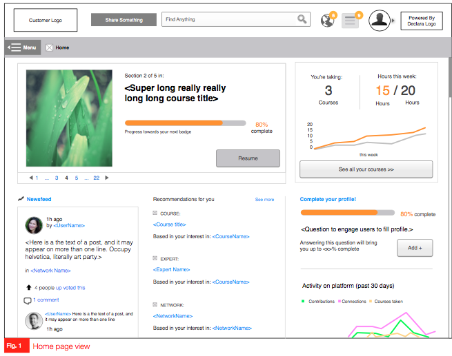
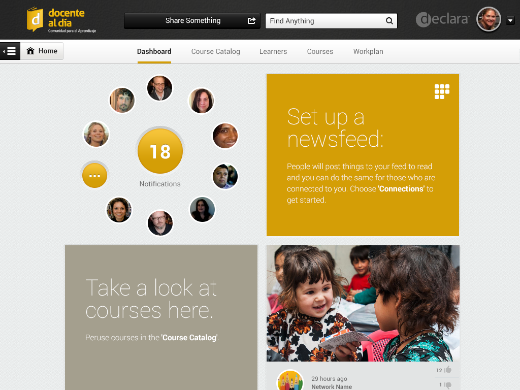
A centralized dashboard that visualizes and organizes learning data, enabling students and teachers to understand progress, relationships, and outcomes quickly.
I designed desktop, tablet and phone dashboards for Declara, Inc. The feature were tested for diverse clients as part of a series of iterations and redesigns, in which I actively participated.
The UX work presented here was completed by me in collaboration with a design team that included the Design Director, a Senior UX Designer, and a Senior Visual Designer.
My Work
Data research
Ideation through sketches
Low-fidelity wireframes
High-fidelity visuals
High-fidelity clickable prototypes
Interactive prototypes with complete flows and micro-interactions
Problem Definition
As apps become more complex, the data they present must be displayed in ways that users can easily understand and act upon. Efficient, clear dashboards improve productivity, user engagement, and retention.
Earlier versions of the app focused on a different learning approach. The new goal was to redefine user needs and create tools that help users communicate, track, interact, and engage effectively.
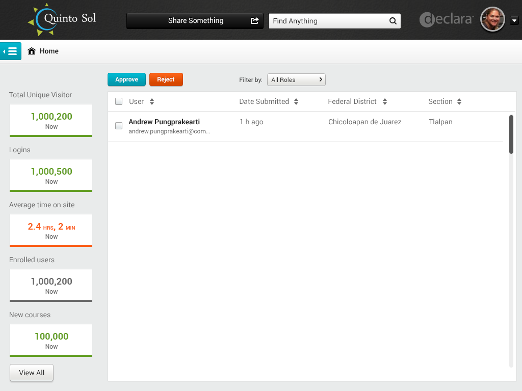
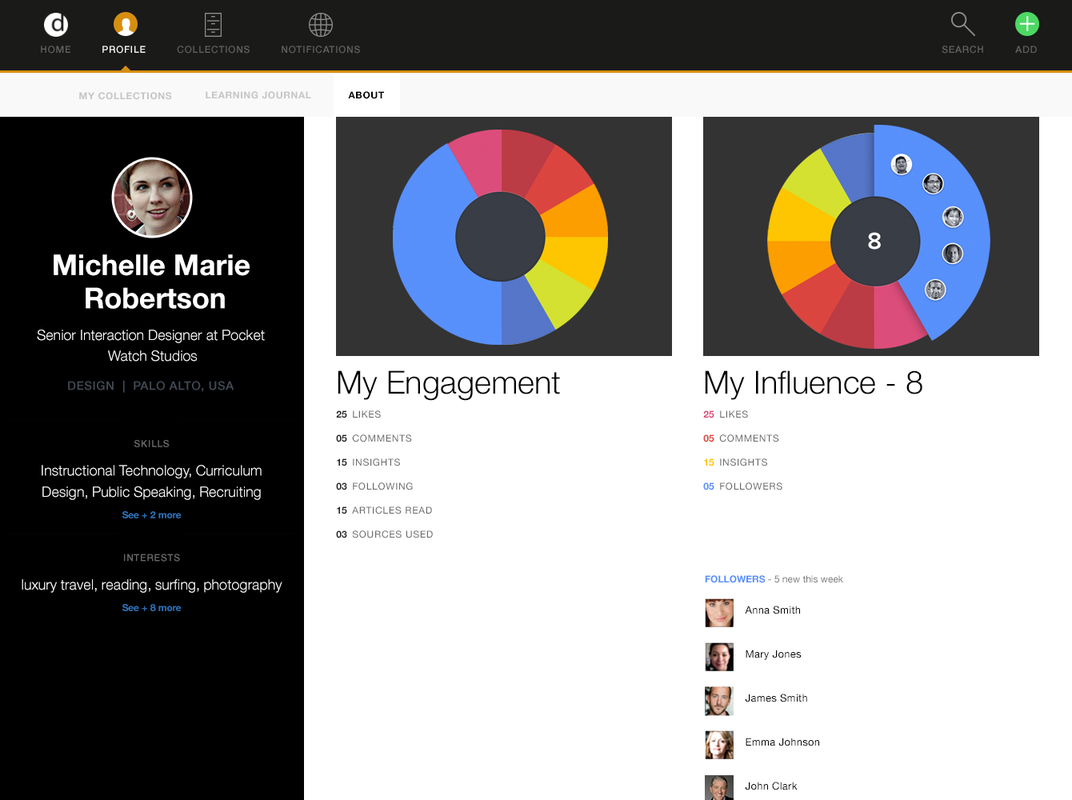
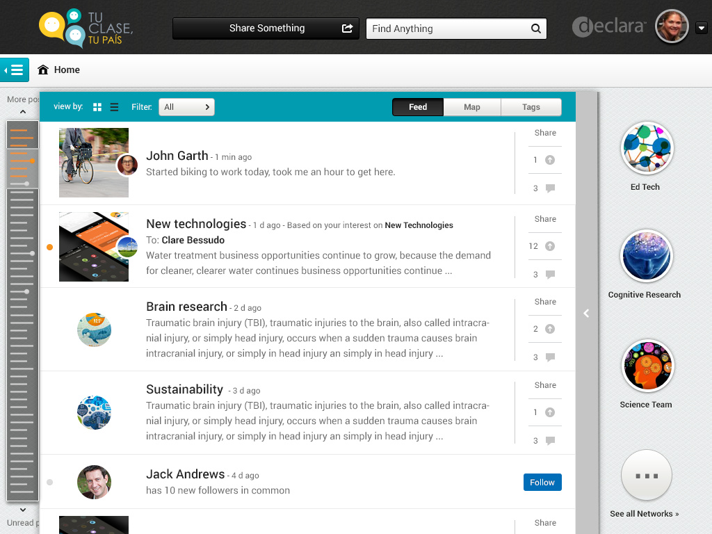
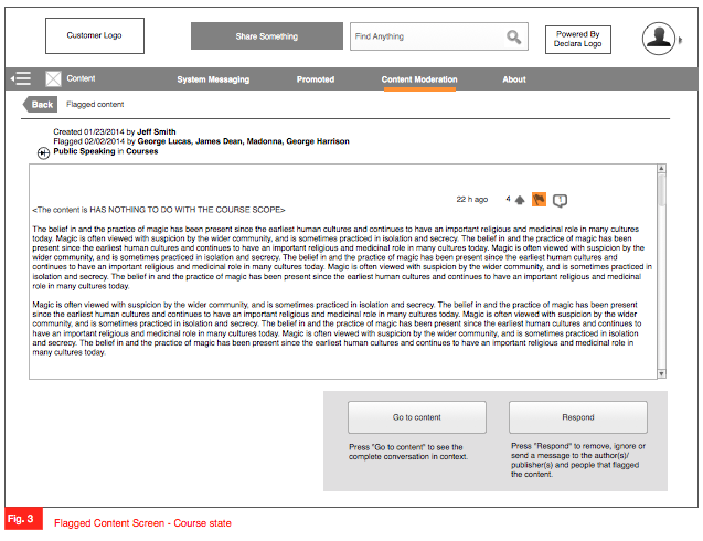
Main Screens


Process
Step 1 – Framing
The product team (2–4 Product Leads) and the design team (2–4 designers) met to define and analyze the new dashboard requirements. I reviewed the specs and requirements defined by the PM lead to establish a foundation for design.
Step 2 – Sketches & Comparative Analysis
I analyzed comparable dashboards, infographics, and critical information presentations, including Airbnb, Google Analytics, Google+, Facebook Analytics, Lynda, LinkedIn Learning, and various CRMs.
Reviewed use cases and researched best practices, patterns, and guidelines.
Defined dashboard flows and interactions for evaluation with the design team and product leads.
Used whiteboards and low-fidelity sketches to brainstorm and iterate on requirements for web (desktop) and mobile apps (tablets, phones, and smart devices).
Step 3 – Wireframes
Created wireframes to define dashboard architecture, flow, interactions, states, and errors.
Collaborated with teams to review, refine, and align on design ideas.
Step 4 – Visual Design
Designed high-fidelity visuals for dashboards, including asset libraries, state options, and interactions.
Reviewed visuals with the Senior Visual Designer.
Assisted in creating interactive presentations for investor and stakeholder demos.
Step 5 – Interactive Prototypes
Developed clickable prototypes to facilitate communication with engineers and stakeholders.
Tested prototypes internally with the design team to refine interactions and flows.
Step 6 – Delivery & Follow-Up
Shared and discussed UX and visual designs with peers, product leads, engineers, and stakeholders.
Collaborated with engineers to troubleshoot issues and solve problems.
Ensured alignment with the product roadmap, progress, requirements, and deadlines.
1. Gather & Summarize Data

2. Organize & Display Reports
3. Prioritize & Arrange Information
4. Communicate & Use Tools
Solution
As a result, multiple dashboards were successfully released online. I:
Communicated dense information efficiently and effectively.
Defined relevant quantitative and qualitative data to display, including features, navigation, and metrics.
Summarized complex information visually through graphs, charts, plots, maps, overlays, icons, text, images, and drawing objects.
Helped users work smarter and succeed by providing intuitive, actionable dashboards.
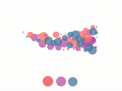
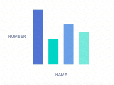
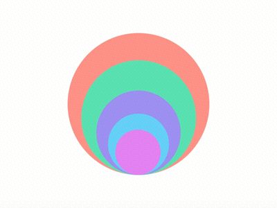
Data Visualization examples I analyzed
Animations and visual cues were used strategically to improve user experience:
Loading animations, progress bars, and skeleton content help users stay informed while waiting for data processing.
When processing large datasets takes time, suggesting delivery via email maintains trust and supports user engagement.
Thoughtful use of animation fills “waiting time” meaningfully, enhancing usability, satisfaction, and retention.